

Have you ever been tasked by a business stakeholder to add additional metrics into a graph while maintaining a clean and uncluttered visualisation ? Adding tooltips to a dashboard can help you with this task and greatly enhance the user experience. Here are several reasons why it’s important to include tooltips.
1. Contextual Explanation
Tooltips provide additional information and context to specific data points, charts, or graphs without cluttering the main dashboard interface. Don’t forget that clutter is your enemy, everytime you put information in front of your audience, you are creating cognitive load.
2. Interactivity
Tooltips promote interactivity by allowing users to explore data dynamically. When users hover over a data point or a chart element, relevant information appears, enabling them to dive deeper into the details that matter most to them. This interactive feature enhances user engagement and satisfaction.
3. Personalization
Similar to images, tooltips can be customised to enhance the overall look and feel of the dashboard. By the way, if you want to read more about adding images, check this article: Adding Images to Your Looker Dashboard
Adding Tootlitps in Looker: A Step-by-Step Guide
To enhance your analysis, consider adding the following tooltip:
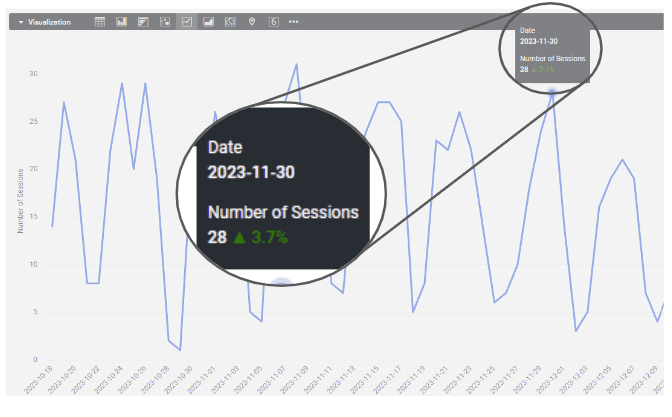
For this visualisation, we used the period-over-period analysis method implemented in Looker. If you wish to know more about this method, feel free to inquire in the comments or refer to the Google documentation available here: Methods for Period Over Period (PoP) Analysis in Looker
The first step is to compute the measure:
If we want to compute the period over period evolution in percentage we need to identify the selected period and the previous period:
Now that we have the two measures, let’s compute the period over period percentage:
Finally let’s display the period over period percentage using Liquid:
*{{ rendered_value }} displays the number of the sessions in the selected period.
This code will show you the tooltip below.
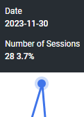
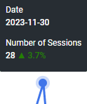
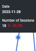
If you wish to customise the format further by adding colours and symbols to better understand positive or negative evolution, consider the following adjustments:
The first condition will define the colour, and the second condition will put the appropriate symbol. Find below two examples:
Conclusion
Now, you have a tooltip providing a clear period-over-period comparison without adding unnecessary clutter. Feel free to use this method to add pertinent information and enhance the understanding of your data points. Additionally, Looker offers the option to customise tooltips using an advanced editor in the explore feature, refer to the documentation here. Feel free to comment if you’d like a step-by-step guide on this customization process.
Thank you
If you enjoyed reading this article, stay tuned as we regularly publish articles on Business Intelligence with Looker and how to get the most value of this tool. Follow Astrafy on LinkedIn to be notified for the next article ;).
If you are looking for support with your Looker implementation, advice on Data Stack or Google Cloud solutions, feel free to reach out to us at sales@astrafy.io.


